Elevating the Mobile Coding Experience
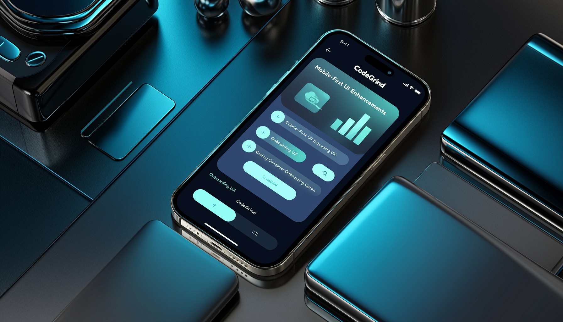
In the fast-paced world of software development, flexibility and accessibility are key. CodeGrind is continuously evolving to meet developers where they are, and recent updates highlight a strong focus on enhancing the mobile user experience. This post dives into the latest UI improvements and onboarding refinements designed to make practicing coding skills on the go as effective and intuitive as possible.
The recent development activity shows a clear push towards optimizing the platform for smaller screens and touch interactions. Commits like “feat: enhance mobile experience with ticker callouts and layout adjustments” and “feat: add MobileTowerDefenseDock component for tower defense game UI” point to specific components being tailored for mobile. Furthermore, “feat: Add mobile shell visibility management and enhance layout responsiveness” indicates a broader architectural effort to ensure the entire interface adapts gracefully across devices.
Streamlining Onboarding on Mobile
A crucial aspect of any platform is its onboarding process. For mobile users, this needs to be particularly smooth and guided. Recent work has focused on making this first interaction with CodeGrind effortless.
- Improved Callout Behavior: Enhancements like “Implement manual continue functionality and enhance mobile callout behavior in onboarding steps” ensure that users are guided through the initial setup and feature introductions without being overwhelmed.
- Responsive Layouts: Adjustments across learning and store pages (“feat: enhance responsive design and layout adjustments across learning and store pages”) mean that whether a user is browsing for new challenges or managing their in-game assets, the experience is consistent and user-friendly.
- Compact Shell Modes: The introduction of “compact landscape shell mode” caters to different device orientations, maximizing screen real estate for focused coding sessions even on mobile.
These changes are not just about making the interface look good; they are about reducing friction and allowing users to quickly engage with CodeGrind’s core features, whether they’re learning new data structures or diving into the Tower Defense game.
Practical Takeaways for Developers
The ongoing commitment to mobile-first development at CodeGrind offers valuable insights:
- Prioritize Responsive Design: Ensure your UI components and layouts adapt seamlessly to various screen sizes and orientations. This is no longer an afterthought but a core requirement for broad accessibility.
- Simplify Mobile Onboarding: First impressions matter. Focus on clear, concise guidance for new users, especially on mobile where screen real estate is limited. Use callouts and step-by-step flows effectively.
- Optimize for Touch Interaction: Design with touch targets in mind and ensure navigation is intuitive for touch-based input.
- Iterate Based on Feedback: The frequent commits addressing mobile UX suggest a responsive development cycle, incorporating user feedback to refine the experience continuously.
By focusing on these areas, CodeGrind is building a more inclusive and accessible platform for coders everywhere.
Explore the latest features and improvements by visiting https://codegrind.online. For a deeper look into the project’s development, check out the repository at https://github.com/rivie13/CodeGrind.